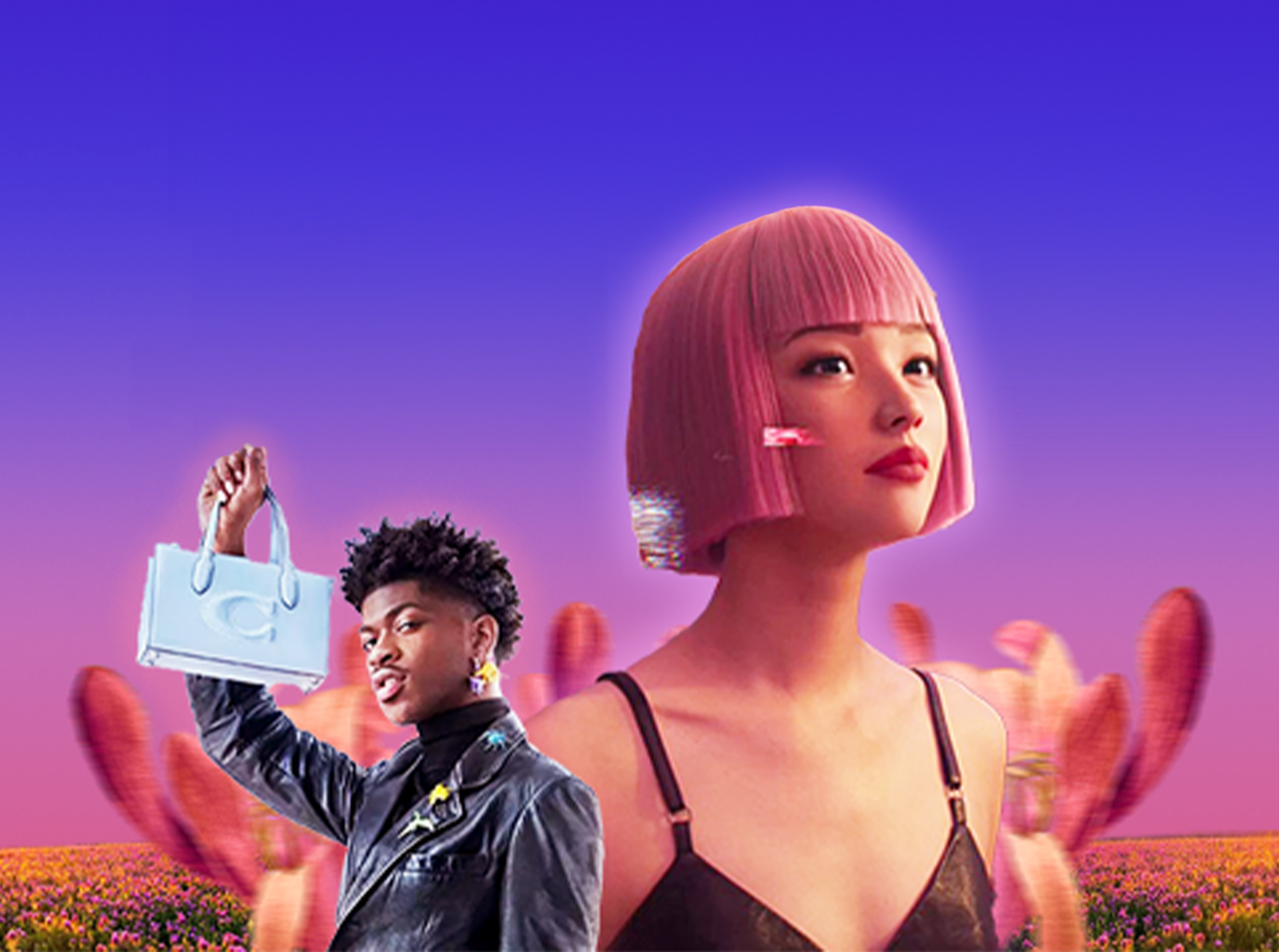


Au Notebook
Dopamine Design – The “Additional” Design Trend That Is Shifting The Visual Game
If there’s ever been a product with eye-catching packaging on a supermarket shelf that makes you stop and pay attention, a banner that you can’t help but click on, or simply a color scheme that makes you feel happier – that’s the effect Dopamine Design is creating.
Foreword
After many years of Minimalism, the Dopamine Design trend has emerged as a colorful “push”, reawakening consumers’ sense of excitement when seeing bright color palettes. Dopamine Design is not just a shift in aesthetic style, but is also gradually redefining the way brands connect with consumers’ emotions. And perhaps, this is the time for brands to ask themselves: is their current design fun enough?
What is the Dopamine Design trend?
As the name suggests, Dopamine Design harnesses the power of dopamine – the “happy hormone” through design. This design trend hits your emotions right away, stimulating feelings of excitement, anticipation, and even making you want to own the product right away!
Some “signs to recognize” Dopamine Design style:
👉🏻 Bright, outstanding colors like neon colors, fresh pastel colors
👉🏻 Unconventional typography, “chaotic” but purposeful layout
👉🏻 Patterns and illustrations with a “Gen Z vibe” evoke a sense of spontaneity and creativity
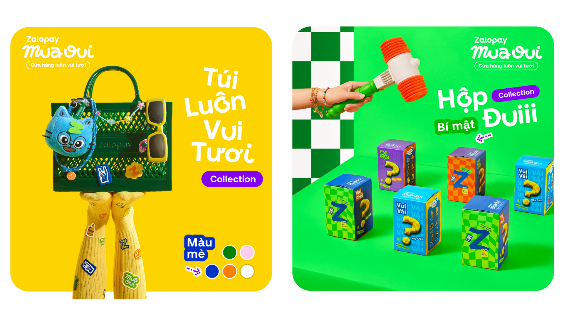
Zalopay also catches up with the Dopamine Design wave
The Transition from Chobanicore to Dopamine Design
For more than a decade, Chobanicore – derived from the popular American yogurt brand Chobani – has been the dominant aesthetic that has dominated supermarket shelves. Chobanicore designs are meticulous and elaborate, yet still feel harmonious, familiar, and natural.
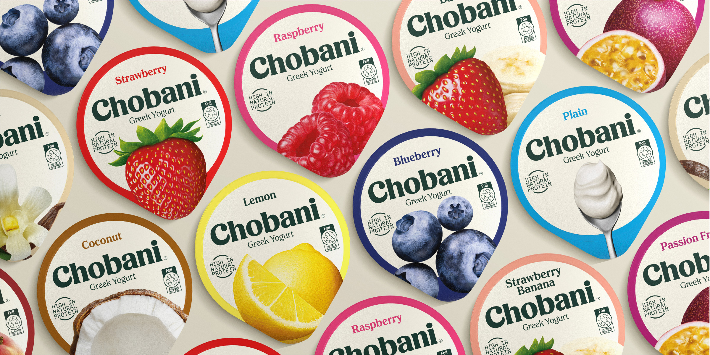
Chobanicore was a dominant design style for over a decade.
According to Fast Company, Millennials want brands to have a story, to have an ideal, to have social responsibility. They choose to buy because of value. Therefore, they love what is authentic, sustainable, safe – that’s why they “fall in love” with minimalist designs, neutral tones, simple fonts. In contrast, Gen Z is a generation that is always “surrounded” by countless information and choices. Attention has become a “luxury item”, and brands have to “grab the spotlight” in a split second if they don’t want to be ignored.
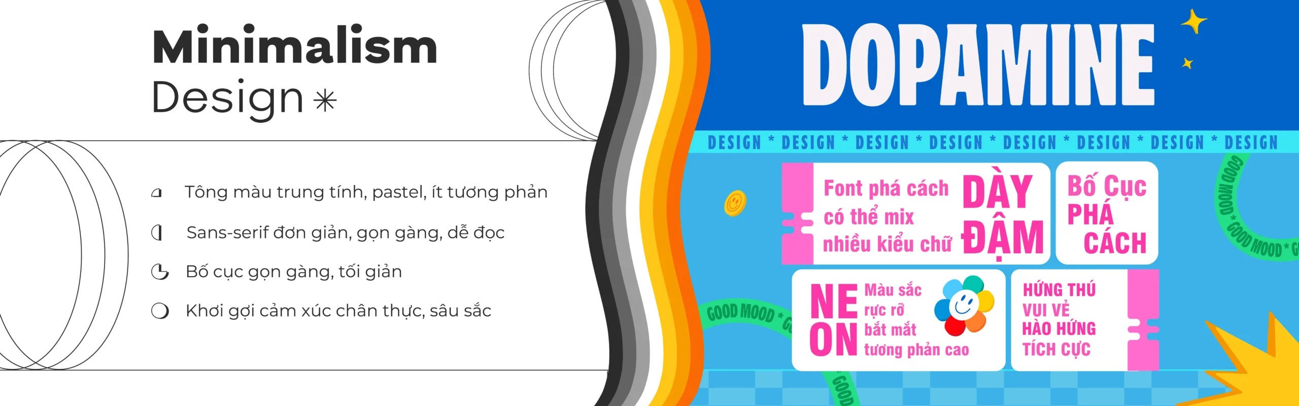
Minimalism vs. Dopamine Design: The Visual Game is Changing
This shift is more than just a race for colors or fonts. It reflects the way people consume content—faster, shorter, and more emotionally demanding in a split second. When a design has less time to tell a story, it has to appeal to emotions immediately.
When Dopamine Design “infiltrates” into everyday life – from fashion to living space design trends
More than just a visual trend on packaging or media campaigns, Dopamine Design is becoming a wave that influences the way consumers choose and design their lives – from the way they dress to the space they live in.
In recent years, Dopamine Dressing has gradually emerged as a trend. Young people not only dress beautifully, but also dress for fun with bright colors, eye-catching patterns and spontaneous outfit combinations, without following any rules.
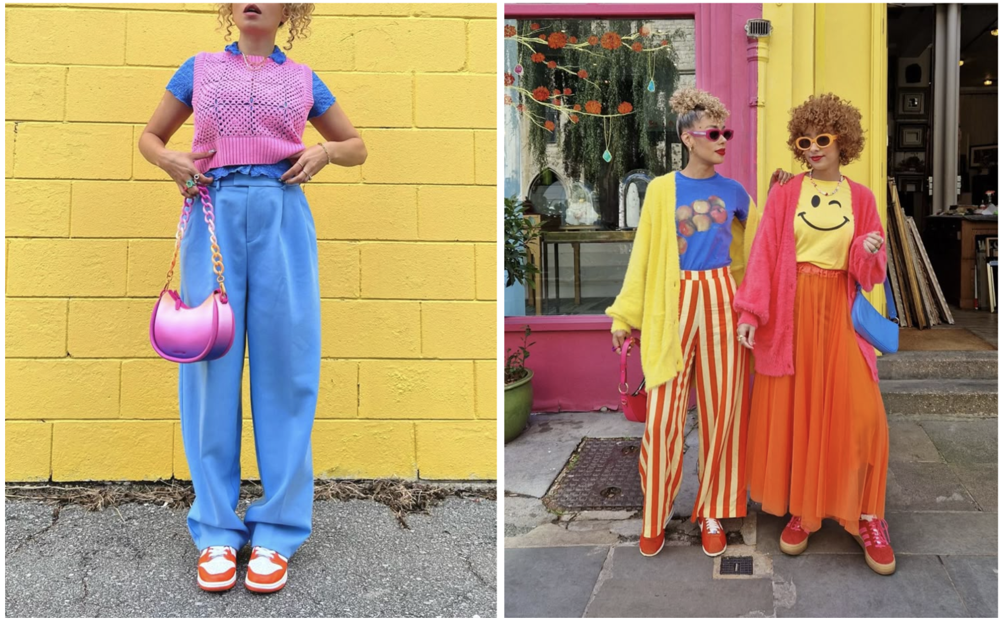 When fashion becomes a dose of dopamine with bright colors
Source: Pinterest
Dopamine Design is creeping into modern living spaces. Instead of minimalist beige-brown tones, spaces are now brightened with bright pastel walls, pop-art paintings, terracotta or neon blue sofas. Interior design is no longer just about being exquisitely beautiful, but also about stimulating inspiration and positive energy every day.
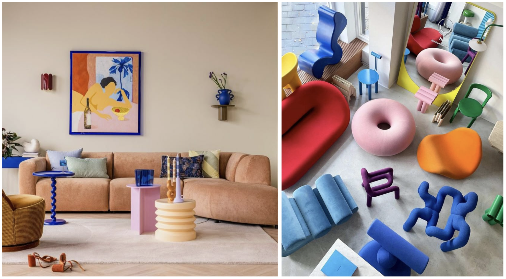
Dopamine Decor living space decoration trend with vibrant color palette, creative interior
Source: Pinterest
Applying Dopamine Design to Your Brand
Without having to “turn upside down” the identity or follow every colorful trend, the brand can still flexibly apply Dopamine Design to refresh itself – just enough to create a visual effect, while still maintaining its own uniqueness.
- Start with color
A vibrant color palette can change the entire mood of the viewer. Brands don’t need an overly vibrant color palette, but can choose 1-2 prominent, youthful tones to use for special occasions, seasonal campaigns or social campaigns. Colors chosen at the right time and in the right context can increase the level of attraction while ensuring brand consistency.
👉🏻 Suggestion from Aurora : Not all bright colors are called Dopamine Design. Think about the emotion you want users to remember and choose colors that evoke that emotion.
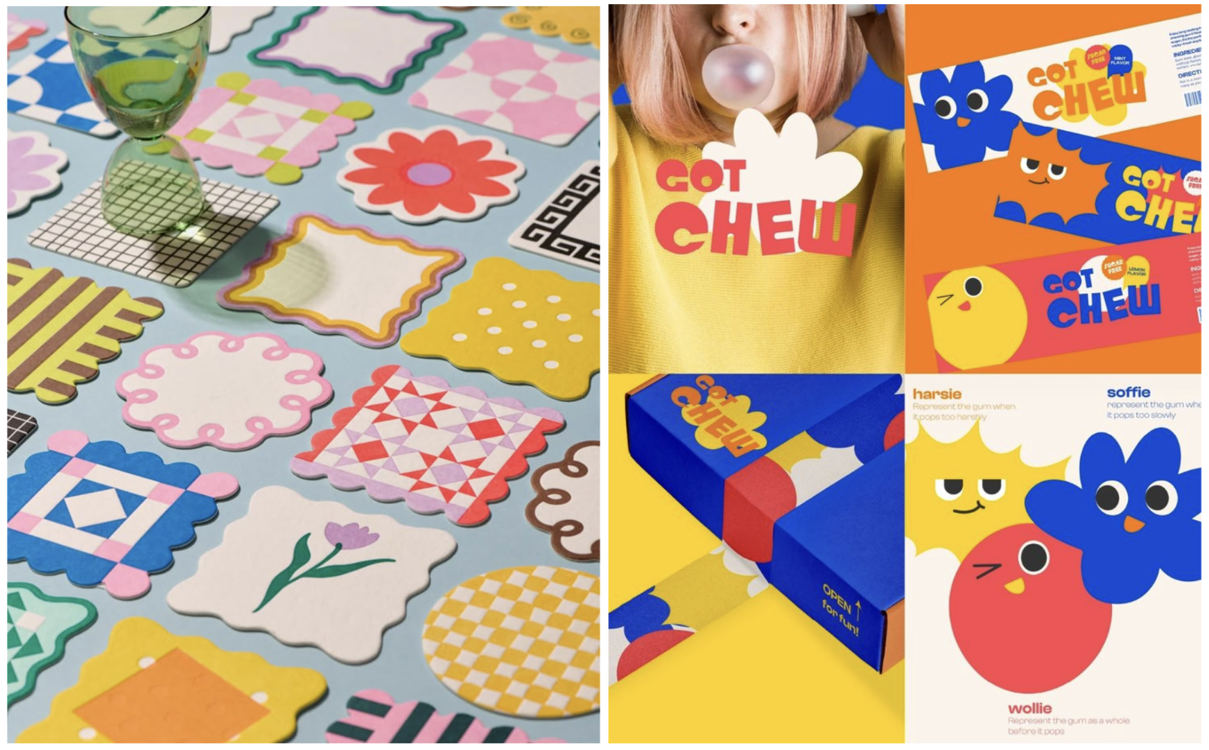
Source: Pinterest
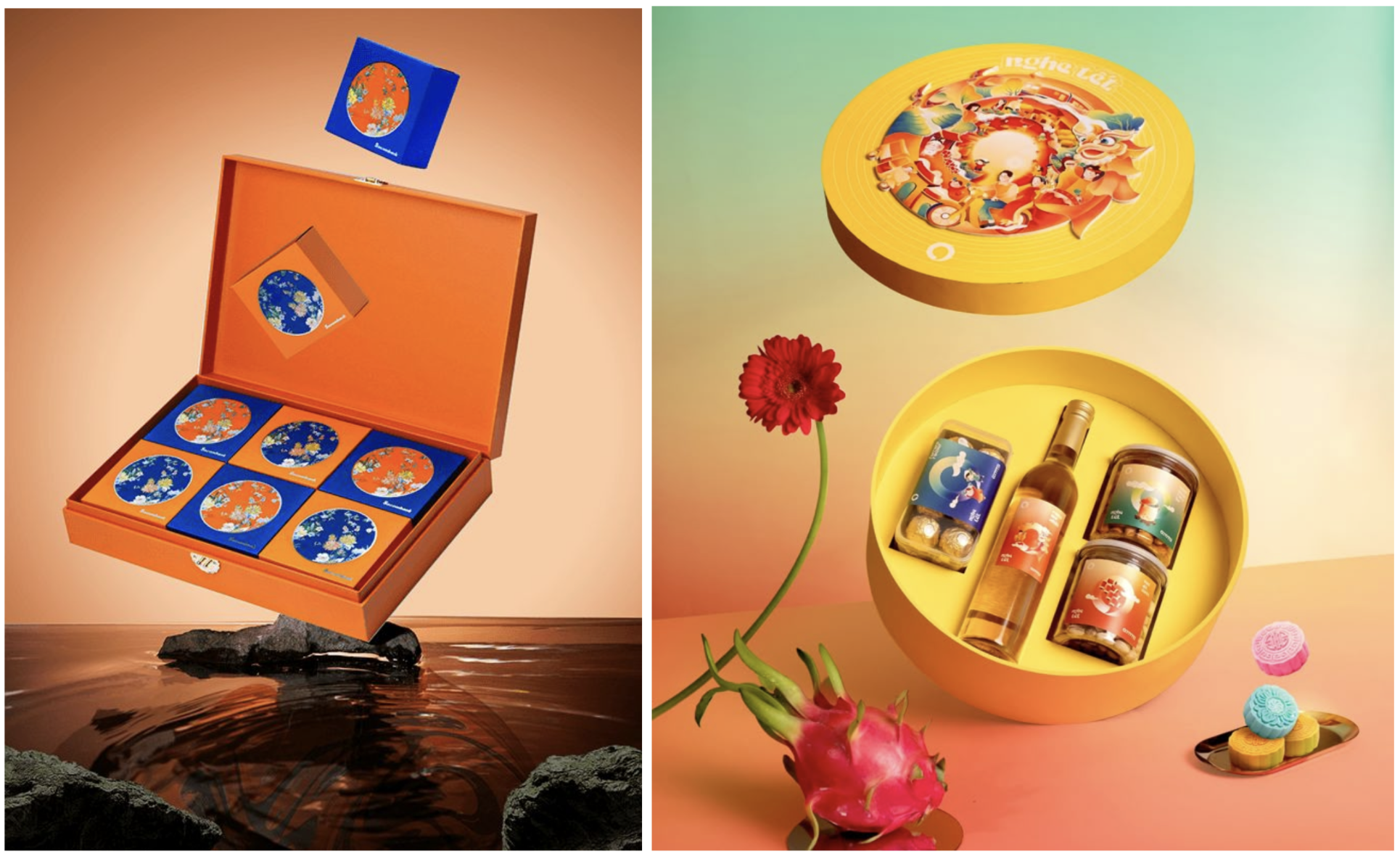
- Refresh product packaging seasonally
The product may be an old formula, but seasonal packaging makes the user feel something new. Designing packaging for holidays, summer, festival season… helps the brand create highlights without changing the core product.
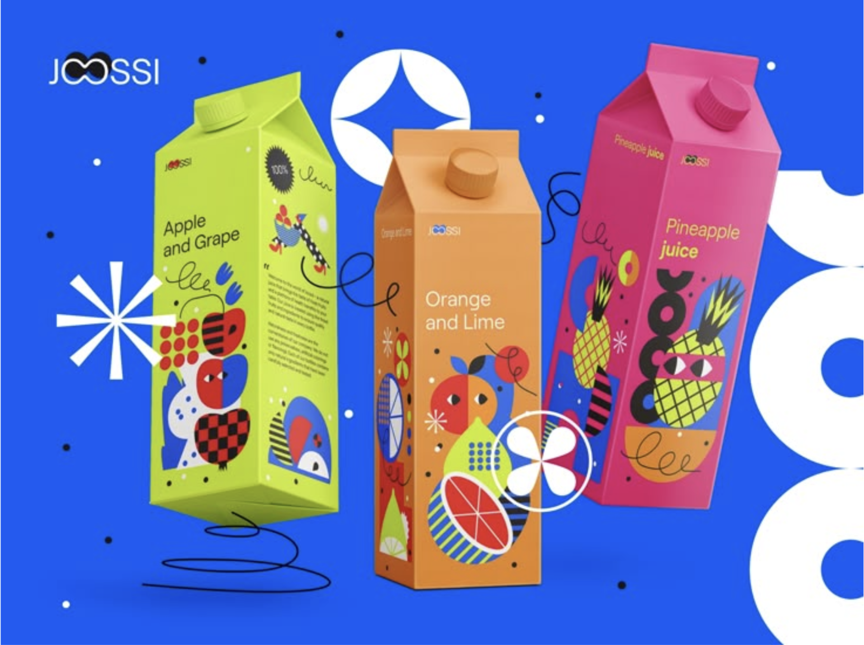
Source: Pinterest
👉🏻 Suggestion from Aurora : Seasonal packaging – from Tet, summer, Mid-Autumn Festival to year-end festivals – is a simple but effective tool to create purchasing motivation. A series of seasonal packaging designs with a lively, fun vibe will help brands attract consumers with the feeling of wanting to own a “limited” edition.
Source: Pinterest
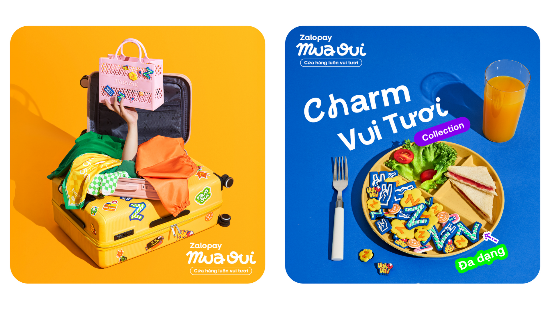
- Bringing fresh colors to digital platforms
Dopamine Design doesn’t just apply to packaging – it’s also effective on other touchpoints like social media, landing pages, and branded banners.
👉🏻 Suggestion from Aurora : Brands can apply the Dopamine Design trend in key visuals, Instagram story templates or UI/UX experiences on websites to create a sense of fun at first sight.
Source: Zalopay
In short
Dopamine Design is not simply a flashy, flashy design trend, but is becoming a new approach in the journey to touch users’ emotions. In the context of increasingly expensive attention, a design that “unlocks” emotions can be the key factor for a brand to stand out.
🔍 You ask – Aurora answers
- What is Dopamine Design?
Dopamine Design is a design style that uses bright colors, creative layouts, and “emotionally stimulating” visual elements to create an immediate feeling of joy and excitement – similar to activating dopamine, the happy hormone in the brain.
- Why is Dopamine Design becoming a trend?
In an era where consumers consume content faster, shorter, and more emotionally, Dopamine Design helps brands capture attention quickly. This is a shift from years of minimalism, when consumers – especially Gen Z – prioritized visual experiences and positive emotions.
- Is Dopamine Design suitable for every brand?
It’s not necessary to completely overhaul your brand identity to embrace Dopamine Design. Brands can flexibly apply this style to every touchpoint, such as social campaigns, seasonal packaging, or digital design, while still maintaining their brand identity.